Quarterly Results Explained: 8 Ratios That Reveal the Real Story
- 1. Earnings Per Share (EPS)
- 2. Price-to-Earnings (P/E) Ratio
- 3. Operating Profit Margin (OPM)
- 4. Net Profit Margin (NPM)
- 5. Interest Coverage Ratio
- 6. Debt-to-Equity Ratio (D/E)
- 7. Return on Equity (ROE) / Return on Capital Employed (ROCE)
- 8. Cash Flow from Operations (CFO)
- The Bottom Line
- Frequently Asked Questions
You open a quarterly result PDF. Revenue up 12%. Profit up 20%. Looks good.
Stock falls 8% the next morning.
What did you miss?
Probably the same thing most retail investors miss, the difference between reported numbers and what those numbers actually mean. A profit surge that's actually a tax credit. Revenue growth that's sitting in unpaid invoices. Margins that look stable until you check the segment breakdown.
Q2 FY26 was full of these. Suzlon's 538% profit jump was mostly accounting. Tata Motors' India growth is hiding behind JLR's collapse. HUL's revenue up, volumes flat.
This guide breaks down the 8 key financial ratios that separate useful analysis from headline-scanning. No theory. Just what to check, where to find it, and what good versus bad looks like, with examples from results that dropped in the last 60 days.
1. Earnings Per Share (EPS)
The simplest question in investing: how much profit did the company make for each share you own?
That's EPS. Total profit divided by total shares outstanding.
Formula: Net Profit ÷ Number of Shares
Where to find it: Bottom of the P&L statement. Every quarterly result PDF has it.
What good looks like: EPS growing consistently quarter over quarter, year over year. Doesn't matter if it's Rs 2 or Rs 200, the trend matters more than the absolute number.
What bad looks like: EPS jumping 50% because the company bought back shares, not because profits grew. Or EPS falling while revenue rises, means costs are eating into earnings.
The trap most miss: There are two EPS numbers, Basic and Diluted. Basic counts current shares. Diluted includes stock options, convertible bonds, everything that could become shares later.
If Diluted EPS is significantly lower than Basic EPS, the company has issued a lot of stock options. Your ownership will get diluted. Check both.
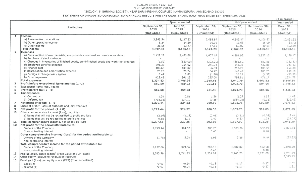
Q2 FY26 example: Suzlon's EPS looked incredible after that 538% profit surge. But strip out the Rs 717 crore tax credit, and the underlying earnings tell a different story. The EPS was optically inflated by a one-time accounting entry.
Source - Suzlon
2. Price-to-Earnings (P/E) Ratio
EPS tells you what the company earned. P/E tells you what the market is willing to pay for those earnings.
A stock trading at Rs 500 with EPS of Rs 25 has a P/E of 20. Meaning investors pay Rs 20 for every Rs 1 of profit.
Formula: Current Share Price ÷ EPS
Where to find it: You calculate this yourself. EPS from the result PDF, price from any stock app.
What good looks like: Depends on the sector. IT companies trade at 25-30x. Banks at 10-15x. PSUs at 8-12x. Compare P/E with the sector average and the company's own 5-year average.
Read more: What is PE Ratio
What bad looks like: P/E way above sector average without a clear reason (faster growth, better margins). Or P/E suddenly dropping - could mean the stock price crashed, or earnings spiked due to one-time gains.
The trap most miss: Never use quarterly EPS × 4 to annualise. Seasonality will fool you. Always use TTM (Trailing Twelve Months) - sum of the last four quarters.
Also: Low P/E doesn't mean cheap. Cyclical stocks like steel and cement show low P/E (4x-6x) at cycle peaks when earnings are abnormally high. That's often the worst time to buy.
Q2 FY26 context: Nifty 50 revenue grew 7.6% this quarter, but the index trades at 21-22x earnings - close to its long-term average of 20.7x. When P/E stays high without earnings acceleration, either earnings need to catch up or prices correct.
3. Operating Profit Margin (OPM)
Revenue tells you how much came in and OPM tells you how much stayed after running the business.
A company with Rs 100 crore revenue and Rs 20 crore operating profit has a 20% OPM. For every Rs 100 earned, Rs 80 went to raw materials, salaries, rent, electricity. Rs 20 remained.
Formula: Operating Profit (EBIT) ÷ Revenue × 100
Where to find it: Calculate from P&L. Revenue is Row 1. Operating profit is usually 'Profit before exceptional items and tax' - before interest and tax adjustments.
What good looks like: Depends heavily on sector.
- IT services: 20-25% (low capital, high margins)
- FMCG: 15-20%
- Manufacturing: 10-15%
- Retail: 5-10% (volume game, thin margins)
Compare with the company's own margins from previous quarters. Expansion = pricing power or cost control. Compression = trouble.
What bad looks like: Margins shrinking quarter after quarter. Means either input costs are rising and the company can't pass them on, or competition is forcing price cuts.
The trap most miss: A company can show revenue growth while margins collapse. Top line looks great, but the business is actually getting weaker. Revenue up 15%, OPM down from 18% to 12% - that's a problem, not a win.
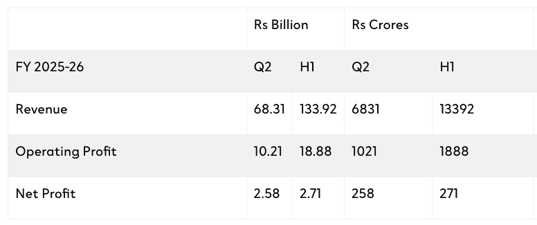
Q2 FY26 example: Apollo Tyres' net profit fell 13% YoY. Looks bad. But OPM actually expanded by 130 basis points to 14.9%. The core business got more efficient. Bottom line was hit by one-time items, not operations. An investor who only read the profit headline would have missed the real story. Source.
Source - Apollo Tyres
4. Net Profit Margin (NPM)
OPM shows what the business keeps before paying interest and taxes. NPM shows what shareholders actually get after everything is paid.
Same company, same quarter - OPM might be 15%, NPM might be 8%. The difference? Interest on loans, tax to the government.
Formula: Net Profit (PAT) ÷ Revenue × 100
Where to find it: Both numbers are in the P&L. Net Profit is usually Row 7 or labelled 'Profit After Tax.'
What good looks like: Stable or improving NPM over quarters. Consistency matters more than the absolute number. A company maintaining 12% NPM for 8 quarters straight is healthier than one swinging between 8% and 18%.
What bad looks like: OPM stable but NPM falling. This means the business operations are fine, but debt is eating into profits (rising interest costs) or tax structure changed.
The trap most miss: High NPM from 'Other Income' - interest on deposits, one-time asset sales, dividend from subsidiaries. This isn't core business profit.
If a company shows 14% NPM but 4% of that comes from selling land, the real NPM is 10%. Next quarter when there's no land to sell, NPM drops and investors panic. The information was always there in the P&L - most just didn't look.
The analogy: OPM is how efficiently you run your shop. NPM is what you take home after paying the bank loan EMI and income tax. Both matter, but NPM is your actual reality.
Q2 FY26 example: HUL reported revenue up 2% and profit up 4%. Looks stable. But dig deeper - volume growth was flat (0%). The profit bump came from cost optimisation and price hikes, not from selling more products. When a consumer company can't grow volumes, NPM becomes a band-aid, not a solution. Source.
5. Interest Coverage Ratio
Can the company pay its loan interest from what it earns? That's what this ratio answers.
A company with Rs 100 crore operating profit and Rs 20 crore interest expense has an interest coverage of 5x. It earns 5 times what it owes to lenders. Comfortable.
Formula: Operating Profit (EBIT) ÷ Interest Expense
Where to find it: P&L statement. Operating profit is 'Profit before interest and tax.' Interest expense is usually listed as 'Finance costs' - Row 2(e) in most quarterly filings.
What good looks like:
- Above 3x: Healthy. The company earns enough to comfortably service debt.
- Above 5x: Strong. Significant buffer even if profits dip.
What bad looks like:
- Below 1.5x: Warning sign. Profits barely cover interest.
- Below 1x: Danger. The company is borrowing to pay interest. This is how debt spirals begin.
The trap most miss: Interest coverage can look fine in good quarters and collapse in bad ones. Check the trend across 4-6 quarters, not just the latest one. Cyclical businesses (steel, real estate) can swing from 6x to 1.5x within a year.
Also - some companies capitalise interest (add it to asset value instead of expensing it). This hides the true interest burden. Check 'Notes to Accounts' for capitalised interest.
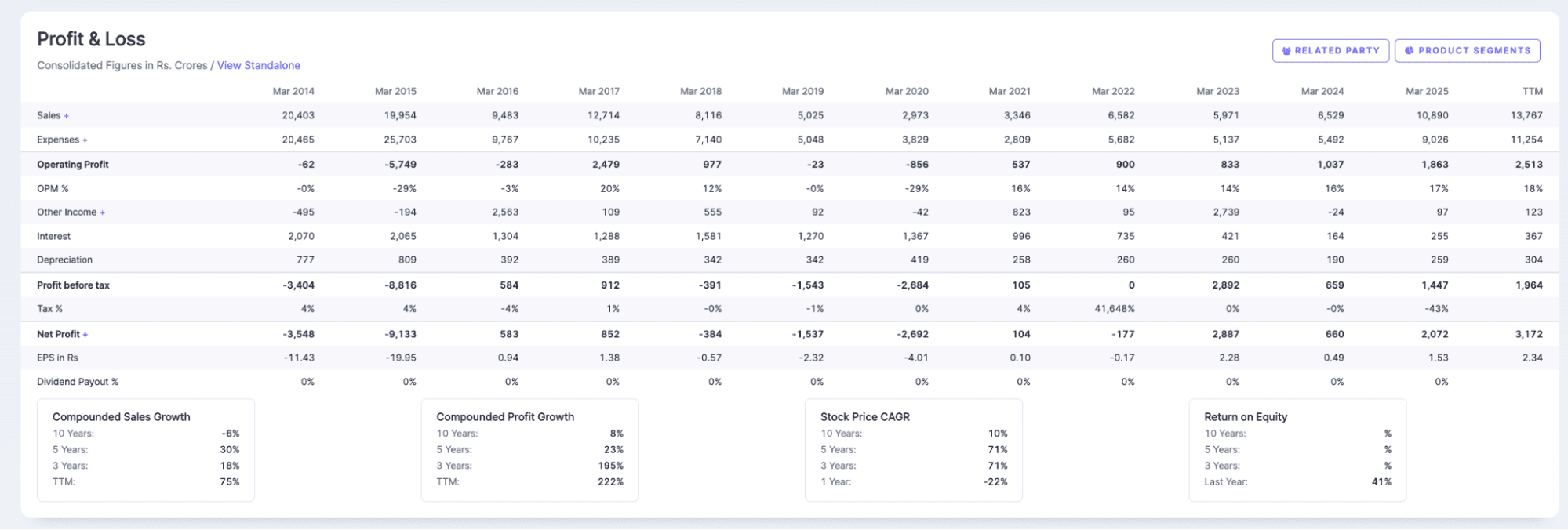
Q2 FY26 example: Suzlon's P&L tells of a decade-long turnaround. In 2015, interest expense was Rs 2,065 crore against negative operating profit. The company couldn't cover interest - classic debt spiral. Fast forward to March 2025: operating profit Rs 1,863 crore, interest just Rs 255 crore. That's 7.3x coverage. From borrowing to pay lenders to comfortably earning 7 times the interest bill. That's what deleveraging looks like in numbers.
6. Debt-to-Equity Ratio (D/E)
How much of the company is funded by loans versus shareholders' money?
A company with Rs 500 crore debt and Rs 1,000 crore equity has D/E of 0.5. For every rupee from shareholders, the company borrowed 50 paise. Manageable.
Formula: Total Borrowings ÷ Shareholders' Equity
Where to find it: Balance sheet. Only available in Q2 and Q4 results (half-yearly disclosure). 'Borrowings' under liabilities, 'Equity' at the top.
What good looks like:
- Below 1: Conservative. More equity than debt.
- Between 1-2: Acceptable for capital-intensive sectors (manufacturing, infra).
What bad looks like:
- Above 2: Highly leveraged. Vulnerable if profits dip.
- Rising D/E without revenue growth: Company borrowing to survive, not grow.
The trap most miss: D/E rising while 'Capital Work in Progress' (CWIP) also rises is fine - company is borrowing to build capacity. D/E rising with flat revenue and no CWIP increase? That's borrowing to fund losses. Very different situations, same ratio movement.
Also check if debt is short-term or long-term. Heavy short-term debt means repayment pressure soon.
Q2 FY26 example: Ola Electric's debt keeps rising while revenue collapsed 43% in Q2. Operating cash flow was negative Rs 2,391 crore. The company is borrowing to stay afloat. D/E ratio alone doesn't tell you this. Pair it with cash flow direction. Rising debt plus negative cash flow plus falling revenue is the trifecta you want to avoid. Source.
7. Return on Equity (ROE) / Return on Capital Employed (ROCE)
The company made profit. Great. But how much capital did it need to generate that profit?
A company earning Rs 100 crore profit on Rs 500 crore equity has 20% ROE. Another earning Rs 100 crore on Rs 2,000 crore equity has 5% ROE. Same profit, very different efficiency.
Formula:
- ROE: Net Profit ÷ Shareholders' Equity × 100
- ROCE: Operating Profit (EBIT) ÷ (Total Assets - Current Liabilities) × 100
Where to find it: Calculate from balance sheet and P&L. Or use Screener.in - it auto-calculates both on a trailing basis.
What good looks like:
- ROE above 15%: Generating solid returns for shareholders
- ROCE above 15%: Using all capital (debt + equity) efficiently
- Consistent over 4-5 years: Not a one-time spike
What bad looks like:
- ROE/ROCE declining over quarters while profit stays flat: Company needs more capital to generate the same profit. Efficiency is falling.
- High ROE but high debt: ROE can be artificially inflated by leverage. Check D/E alongside.
Which one to use when:
- ROCE for capital-heavy sectors: Banks, power, infrastructure, manufacturing. Accounts for debt.
- ROE for asset-light sectors: IT, FMCG, services. Equity is the main capital.
The trap most miss: A falling ROCE often precedes a stock price correction - sometimes by 2-3 quarters. The market eventually catches up to declining capital efficiency, even if headline profit looks fine.
Q2 FY26 example: SBI reported net profit up 10% to Rs 20,160 crore. Impressive headline. But what makes it a quality result is the ROE context. With GNPA at 1.73% (multi-year best) and provision coverage staying strong, SBI isn't juicing profits by under-provisioning. The return is coming from genuine operational improvement - NII growth, better asset quality - not accounting tricks. When ROE improves alongside balance sheet health, that's sustainable.
8. Cash Flow from Operations (CFO)
Profit is an opinion. Cash is a fact.
A company can report Rs 500 crore profit on paper while burning Rs 200 crore cash in reality. Accounting rules allow flexibility - revenue recognition, depreciation methods, provisions. Cash flow doesn't lie.
Formula: It's a separate statement, not a calculation. Look for 'Cash Flow from Operating Activities' in the cash flow statement.
Where to find it: Cash flow statement - only disclosed in Q2 and Q4 (half-yearly). For Q1 and Q3, you're flying partially blind.
What good looks like:
- CFO positive and growing alongside profit
- CFO consistently higher than Net Profit: Company is converting paper profits into actual cash
- CFO covers capital expenditure (capex): Business is self-funding its growth
What bad looks like:
- Profit rising, CFO flat or negative: Red flag. Profits are stuck in receivables or inventory, not reaching the bank.
- CFO negative for 3+ consecutive half-years: Business model isn't generating cash. Survival depends on external funding.
The trap most miss: EBITDA positive, CFO negative. This is the most common sign of aggressive accounting. The 'profit' exists only on paper - as unsold inventory or unpaid invoices. If you see this pattern for 2-3 periods, dig into working capital.
Where the cash disappears:
- Trade receivables rising faster than revenue: Customers aren't paying
- Inventory piling up: Products aren't selling
- Prepaid expenses jumping: Costs shifted to future periods
Q2 FY26 example: Capital India Finance showed a dramatic profit swing in their results. Looks like a turnaround story. But operating cash flow collapsed by 90%. The profit was accounting - the cash wasn't there. This disconnect between reported numbers and cash generation signals severe liquidity stress. When the headline says profit and the cash flow says crisis, trust the cash flow.

Source - Capital India
The Bottom Line
Reading quarterly results is about asking the right questions.
When a company announces 'record profits’, you now know to check whether that came from actual business growth or a one-time asset sale. When revenue jumps 40%, you will look at whether margins held up or got sacrificed for market share. When EPS looks impressive, you will verify the share count didn't quietly shrink through buybacks.
The eight ratios we covered aren't meant to be calculated in isolation. They work together. Strong revenue growth means nothing if cash flow turns negative. Healthy ROE loses credibility when debt-to-equity crosses 2x. A current ratio above 1.5 doesn't matter if half that 'current asset' is stuck in unsold inventory.
Here's a practical approach: Before your next investment decision, pull up the company's latest quarterly filing. Spend 15 minutes with the P&L, balance sheet, and cash flow statement side by side. Calculate three or four of these ratios. Compare them to the previous quarter and the same quarter last year.
You will spot things the headlines missed. That's the edge.
Frequently Asked Questions
1. What is Q1, Q2, Q3, Q4 in the stock market?
In India, financial quarters follow the April-March fiscal year. Q1 runs April to June, Q2 is July to September, Q3 covers October to December, and Q4 is January to March. When a company reports 'Q2 FY26 results’, they are referring to July-September 2025. This differs from the calendar year convention used in the US and Europe, so always check which fiscal year the company follows.
2. When are quarterly results announced in India?
Listed companies must announce results within 45 days of the quarter ending. This creates four earnings seasons: mid-May (Q4), mid-August (Q1), mid-November (Q2), and mid-February (Q3). Most large-caps announced in the first two weeks of this window. You can track upcoming result dates on BSE and NSE websites under corporate announcements.
3. How do I interpret quarterly results quickly?
Start with three comparisons: this quarter vs last quarter (sequential growth), this quarter vs same quarter last year (YoY growth), and actual numbers vs analyst estimates (surprise factor). A company growing revenue 20% YoY but missing estimates by 5% often sees its stock fall. Context matters more than absolute numbers.
4. What does 20x earnings mean?
When someone says a stock trades at '20x earnings’, they are referring to the price-to-earnings ratio. It means the stock price is 20 times the company's annual earnings per share. If a company earns Rs 10 per share and trades at Rs 200, that's 20x earnings. Lower isn't always better, fast-growing companies often trade at higher multiples because investors expect future profits to justify today's price.
5. What's the difference between standalone and consolidated results?
Standalone results show only the parent company's performance. Consolidated results include the parent plus all subsidiaries. For companies like Tata Motors or Reliance with significant subsidiary operations, consolidated numbers tell the real story. Always check consolidated results unless you are specifically analysing the parent entity's core business.
6. Which financial statement should I check first in quarterly results?
Start with the Profit & Loss statement for revenue and profit trends, then move to the cash flow statement to verify if profits converted to actual cash. Save the balance sheet for last to check debt levels and working capital. Most red flags, exceptional items, margin compression, cash flow mismatches surface in the P&L and cash flow statement.
7. How do I know if a company's quarterly results are good or bad?
Don't rely on profit growth alone. Good results typically show: revenue growing faster than industry average, operating margins stable or expanding, cash flow from operations positive, and guidance maintained or raised. Bad results hide behind headlines, a 50% profit jump driven by asset sales while core revenue declines is a warning sign, not a celebration.
- 1. Earnings Per Share (EPS)
- 2. Price-to-Earnings (P/E) Ratio
- 3. Operating Profit Margin (OPM)
- 4. Net Profit Margin (NPM)
- 5. Interest Coverage Ratio
- 6. Debt-to-Equity Ratio (D/E)
- 7. Return on Equity (ROE) / Return on Capital Employed (ROCE)
- 8. Cash Flow from Operations (CFO)
- The Bottom Line
- Frequently Asked Questions
Related Blogs
View more-
5 Momentum Stock Screener Strategies That Beat the Market
DIY Research
16 Dec, 2025
-
How to Build a Watchlist Like a Research Analyst
DIY Research
20 Nov, 2025
-
Unlocking Trading Potential: Exploring the Dynamic Features of TradingView's Research 360 Charts
DIY Research
30 Nov, 2023
-
How Research 360 Can Enhance Your Stock Analysis
DIY Research
18 Sep, 2023


